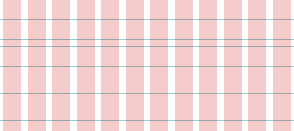
For website developers, hanging your site elements on a baseline grid is an easy and objective way to improve the balance and professionalism of your web designs.
A baseline grid has 2 dimensions: Columns for lining up vertical edges (widths), and rules for aligning type and horizontal edges (heights).
The problem: Most grid templates give you either rows or columns, but not both. You can use the mega-popular 960.gs template for the columns, but then you have to create your own pattern image (or use baseliner.js) for the horizontal rules.
This works pretty well as long as your baseline size stays the same across projects, but it's difficult to tweak your grid and playing with different grid sizes and layouts on-the-fly. Plus it's a pain to track down and upload your baseline images for every new project.
Here's a preview of what the below code creates…
CSS3 Gradients to the rescue!
Here's a baseline grid overlay (with rules and columns) that's built using CSS gradients, so there's no patterns to cut in photoshop, no images to upload, and it's easy to tweak as needed.
It's even easier with a Sass mixin
If you're comfortable with CSS preprocessing using Sass, then the following code is even easier to tweak and modify.
Let me know what you think in the comments! I hope this makes your web development routine slightly more fun and less headachey, as it did for me.


